COVID-19 and Monkeypox: Reporting Tips from Our Newsletter
Last Updated May 2023
The guidance below collects the thoughts, tips, and must-reads about reporting on COVID-19 and monkeypox published in our weekly newsletter, Revisions. The information is presented in roughly chronological order, has been edited for clarity, and is updated where necessary.
Language & Word Choice
February 10, 2022
With all of its complexities and caveats, how can journalists best describe declines in COVID-19 cases and restrictions?
The world has seen a lot of bad news the past few years due to the pandemic, so it makes sense that we’d want to celebrate the good. Reporters, however, should ensure the tone of work describing the easing of restrictions and declining cases keeps this context in mind. Phrases like “back to normal” erase the trauma we’ve all experienced. Many people who’ve been affected by the pandemic will never go back to “normal,” whether due to impact on their personal lives, their loved ones, their economic security or even their psyche. Reporting instead should discuss how communities are (or are not) recovering from the impact of COVID-19, whether that’s emotionally, health-wise, economically, etc.
Similarly, phrases like “opening back up” should be used cautiously when describing the easing of restrictions, which is often a more accurate phrase. In many parts of the U.S., for instance, very little is “closed,” there have been no “lockdowns” for quite some time, and essential workplaces have long been open. The case varies in different countries, of course, so it’s critical reporters are precise when describing changes so as not to over- or understate them.
March 17, 2022
Is it time we use the term “fully vaxxed” to mean being boosted, too?
The CDC currently defines someone as “fully vaccinated” if they’ve received all the recommended doses in their primary series of the COVID-19 vaccine. If you’ve received the Moderna or Pfizer vaccines, for instance, that’s your first and second dose. The CDC calls someone “up to date” when they have received this primary series and a booster dose.
But boosters became available because of waning immunity from the primary series and the CDC itself has shown that immunity wanes just a few months after receiving a booster dose. On March 15, 2022, Pfizer announced they’re seeking FDA approval for a fourth booster dose for medically vulnerable people. With many seeking solace in their vaccination status as a green light to return to “normal,” does that definition of “fully vaxxed” hold up?
News media will likely follow guidelines from institutions like the CDC on this word choice. In the meantime, dropping “fully” — which implies a false finality of vaccination when more boosters may be needed, a la annual flu shots — when possible may be the right move.
July 21, 2022
Health reporters, listen up: Former U.S. FDA Commissioner Dr. Scott Gottlieb said in July that the window for containing the spread of monkeypox in the U.S. “has probably closed.” The global outbreak has thus far mostly affected men who have sex with men. This means reporting on its risks and how to prevent its spread should be amplified with specific care and urgency to that population. But some experts fear focusing too much on those who’ve been impacted most so far misleads the broader public into complacency and risks further spread. Read up on both sides of the debate.
January 19, 2023
Plenty about the outbreak of misinformation surrounding COVID-19 has been studied, but recently researchers called for the field to dig into visual health misinformation.
What does that mean? “Visual content that is typically presented alongside text or audio that contributes to false or inaccurate presentations of information,” according to the study’s lead author.
In response to the research Journalist’s Resource has put together a primer on visual health misinformation. You’ll learn about its three main categories (recontextualization, manipulation, and fabrication) and get advice for journalists on what to do next.
Must-Reads
How did this many deaths become normal?
Ed Yong, The Atlantic
In March 2022, the globe passed 6 million known COVID-19 deaths and was averaging over 5,000 deaths a day. Thanks to the challenges of record-keeping in a pandemic, those numbers in reality are likely higher. So is the number of cases being reported daily thanks to the way many countries have put the burden of testing and tracing on individuals. (coughU.S.cough) Why are we — how are we — just moving on? As a global community, as a country, as families, as individuals? Ed Yong makes a poignant assessment of our perplexing quest for “normal” in the Atlantic. Perhaps it will give you a moment of reflection.
Critical Voices

Philly-based writer Krys Malcolm Belc is referring to closures of dozens of Philadelphia schools in winter 2022 but, since similar closures happened across the U.S. following new COVID-19 surges, they raise a broadly applicable point. Labeling this a “staff shortage” problem not only linguistically blames teachers and administrators; it also glosses over the fact that such shortages often come from them catching COVID-19. This isn’t a hiring problem, or a “no one wants to work anymore” problem. This is the result of the spread of a highly contagious virus and a public health response that prioritizes sending people back to work or school regardless of whether the resources exist to run those workplaces or schools safely. That should be the “headline” here, so to speak.

When the U.S. government announced it would send out four free COVID-19 tests per household, many shared the sentiment that this was not the salve it purports to be. But physician Oni Blackstock explains the tension best by comparing the move to what could have been and reminding us all that equality and equity are not the same.

Couldn’t agree more with writer Zito Madu here. Language is a powerful thing and so much of communication requires using comparisons to help others pick up what you’re putting down. This social media presentation uses a metaphor to describe workers making the choices that feel right for them like a disease, a frame so negative and pro-capitalist it’s hard to overcome, regardless of the article’s contents.

A bit of levity from writer Nicole Korhnher-Stace that doubles as a “wait a minute…” moment. It absolutely should make you wonder why we talk about and report on the relinquishing of pandemic mitigation measures like there will only be positive consequences, despite what we’ve all seen with our own eyes.


The CDC has been criticized for its dual COVID risk maps which tell very different stories to the U.S. public. Their “COVID-19 Community Level” map, which focuses on hospitalization data, is supposed to help individuals determine the impact of COVID on their community. In spring 2022, despite upticks in cases, this map labeled much of the country’s levels as “low.” Meanwhile, the “Community Transmission” map, which showed a much more alarming picture with 75% of counties labeled “high” or “substantial,” was marked as for “healthcare facility use only.”
And, as George Washington University Professor of Medicine and Surgery Dr. Jonathan Reiner pointed out on Twitter, the CDC had been framing the “Community Level” map in an even more positive light before updating its messaging recently. The earlier tweet on the left combines the low and medium levels to mark 90% of the U.S. population; combining medium and high would have underlined the risk for around 30% of the U.S. That’s what the more recent tweet on the right does, instead of combining low and medium to reach a nicer sounding 81%. It’s a perfect (if disappointing) example of how just a tweak in framing can make even “hard facts” like statistics tell completely different stories.
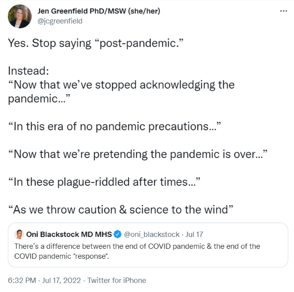
Some of these suggestions may be a bit too facetious for journalists to use, but Jen Greenfield of the University of Denver brings up an important point. Data for the U.S. in July 2022 shows us living at a high plateau of new COVID-19 cases and people are still dying and contracting chronic illnesses and disabilities from their COVID-19 bouts. We are not “post-pandemic” by any means (though some reporters use this to signal “after the pandemic began” which is fair but confusing). Rather, we’re living through a pandemic with very little community or institutional response. An “era of few pandemic precautions” is about right.

Here New York Times reporter Maggie Astor is quoting an infectious disease expert’s recent interview on COVID-19. There’s not much more to say beyond this quote from science communicator Lucky Tran: “The implication that the vulnerable are not ‘average’ people, and their deaths are acceptable, is horrific, and has no place in public health or medicine.”
Reframing Headlines
October 21, 2021

The above Newsweek headline wasn’t the only one from a major news outlet to juxtapose former U.S. Secretary of State Colin Powell’s death with his vaccination status, as Caroline Orr Bueno points out. But it does sum up a story frame that could be used to sow doubt in the efficacy of COVID-19 vaccines. Mentioning Powell’s vaccination status without including that he also had multiple myeloma, which can suppress the immune system and put one at greater risk for COVID-19, misleadingly links his death to vaccine efficacy. The CNN headline below puts Powell’s health into greater context without creating that false connection to the effectiveness of vaccines.

December 2, 2021

The Washington Post headline above leads a story that quotes public health experts and politicians who speak to whether they are seeking to put new mitigation measures in place in the U.S. or recommend doing so. Some of these sources speculate or generalize about the public or political appetite for such health measures, but nowhere in this story does this “tired public” get to speak for itself.
The focus should remain on what we did actually know about Omicron: very little. The CNN headline below gets straight to the point and tells it like it is. Do we like uncertainty? Of course not. But most everything else at this point is speculation and it’s harmful to pretend it isn’t.

January 27, 2022

I want to draw your attention to headlines that differ just ever-so-slightly while reporting on the same topic. The headline above is from Fortune and refers to what Maria Van Kerkhove, the World Health Organization’s technical lead on COVID-19, said in a press briefing in January 2022:
“The next variant of concern will be more fit, and what we mean by that is it will be more transmissible because it will have to overtake what is currently circulating. The big question is whether or not future variants will be more or less severe.”
This means whether the next variant is more or less deadly than Omicron is an open question; it could go either way. Though Fortune’s headline is accurate — yes, it might be more deadly — the headline could just as accurately read, “and it might not be more deadly.” Emphasizing only one of the two potential paths for the next variant makes that possibility more salient in audiences’ minds by obscuring that second option and makes for a scarier read.
The headline below, from CNBC, on the other hand, makes it clear that this is a question the WHO doesn’t have the answer to. Underlining such unknowns is an important part of science reporting, especially during this giant group project we call a pandemic.

February 10, 2022


We take a little departure from our usual Headline Check format to ruminate a bit. Both of the headlines above are from the same outlet (ABC News) and from the same day (February 9, 2022). Right now, an average day in the U.S. brings more than 2,500 COVID deaths, yet February 2022 brought news of states relaxing mandates and politicians pressured to offer hope that the pandemic is essentially over.
I’m not here to argue in favor of any scientifically unnecessary pandemic restrictions. But I do find it hard to digest that we are able as a country, or at least its media, to both describe 900,000 deaths here alone and calmly discuss “moving on” or “living with” this level of catastrophe. The cognitive dissonance of our collective consciousness is mind-boggling.
Like it or not, news outlets have a powerful agenda setting role. Our media systems are such that stories of vastly different import are flattened into the same journalistic treatment in the same smooth “objective” news voice, even if one should be continually screamed from the rooftops. I certainly don’t have all the answers here. But I do think examples like these show just how damaging the journalism industry’s commitment to “just the facts” over context can be to our collective response to tragedy.
March 17, 2022
The last few years with COVID-19 have been full of unknowns. We’ve learned a lot but it’s still critical that journalists are clear about what we do and do not know, and what we can and cannot infer, about this ever-changing pandemic. This type of transparency and humility builds trust with our communities, in addition to being accurate.

The USA Today headline above hits an important note by emphasizing the “ample room for uncertainty” quote. At the end of the day, with COVID-19 news that is often the bottom line.
On the other hand, the ABC News headline below gets points for being more specific — not about what we know, per se, but what science and recent history can help us understand. Throughout the pandemic, what’s happened in Europe has indeed often foreshadowed case counts in the U.S. So, this balances both that uncertainty with a healthy dose of context clues.

April 7, 2022
We’ve got a “good, better, best” situation, folks. All three of these stories refer to a study out of Sweden that examined connections between people who had COVID-19 and their risk in experiencing blood clots. The first headline, below, comes via the Guardian. It’s accurate, of course, but as an English major with stereotypically low numerical literacy, I feel for anyone reading this headline and trying to understand “33-fold” beyond “that’s a lot.” That big number and the gestural “potentially fatal” makes this a dramatic headline, especially considering it leaves out some context we’ll see later.

The headline from the BBC, below, is better. It adds that this higher risk exists for up to six months after one has been infected. It’s important for anyone making decisions around COVID-19 to understand this additional risk to our health, but it’s also good to include this timeline to avoid fearmongering. Additional context that might help there is that this risk was higher when treatments for COVID-19 were fewer and is higher for those who haven’t been vaccinated.
Our “best” option of these, from ABC News, includes the context the BBC had but adds one more thing: “study.” That tells audiences immediately where this news comes from. The source of our news is just as important as the content.

June 2, 2022
Both the headlines below, first from CNBC and second from ABC News, refer to the same statements from the World Health Organization. In a briefing, the WHO’s technical lead for monkeypox was asked whether the outbreak could turn into a pandemic. They replied, “The answer is we don’t know, but we don’t think so,” and continued, “At the moment, we are not concerned about a global pandemic.”
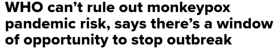
Now, I’m not an epidemiologist and the WHO’s reputation for responding quickly to pandemics has been recently sullied. So, I don’t know which of these headlines is the fairest reading of the WHO statements.
I do know, however, that when given the same information CNBC chose the glass-half-empty frame (“we can’t rule it out”) and ABC chose the glass-half-full frame (“it’s unlikely”). When reading either article, you’ll also notice that the “we are not concerned about a global pandemic” statement is over 250 words into the CNBC article, whereas the ABC article leads with that information. It’s impossible to attribute any intention to either framing or, again, any determination of accuracy. But surely the first headline is much more anxiety-inducing than the second.

July 28, 2022

Both the headline above, from CNN, and the one below, from NBC5 Chicago, do something I hate: ask a question without providing an answer. The question-as-headline scheme is a well-worn clickbait tactic. But these two headlines use this strategy in different ways.
You can almost hear the impatient tone of the CNN headline; that “Now” is doing a lot of work. It expresses more irritation for our current media ecosystem than it describes what audiences will find inside. Plus, the question it poses is a binary: you either worry or you don’t. If we’ve learned anything from COVID-19, we know risk of communicable disease is a spectrum.
While the NBC5 headline doesn’t answer the question it poses, the second clause makes clear that there are many more questions to be answered. It’s signaling that this is primarily a service article where helpful answers will be found, and the content backs it up. So, there’s an exception to every rule (even mine) and not all question headlines are bad form.
